

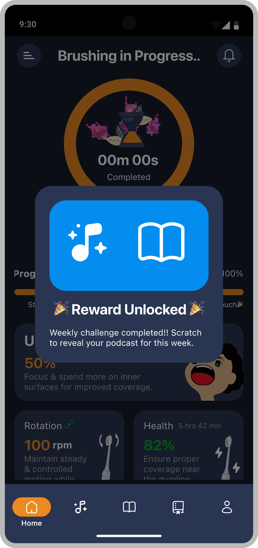
🎉 Reward Unlocked 🎉
Weekly challenge completed!! Scratch to reveal your podcast for this week.
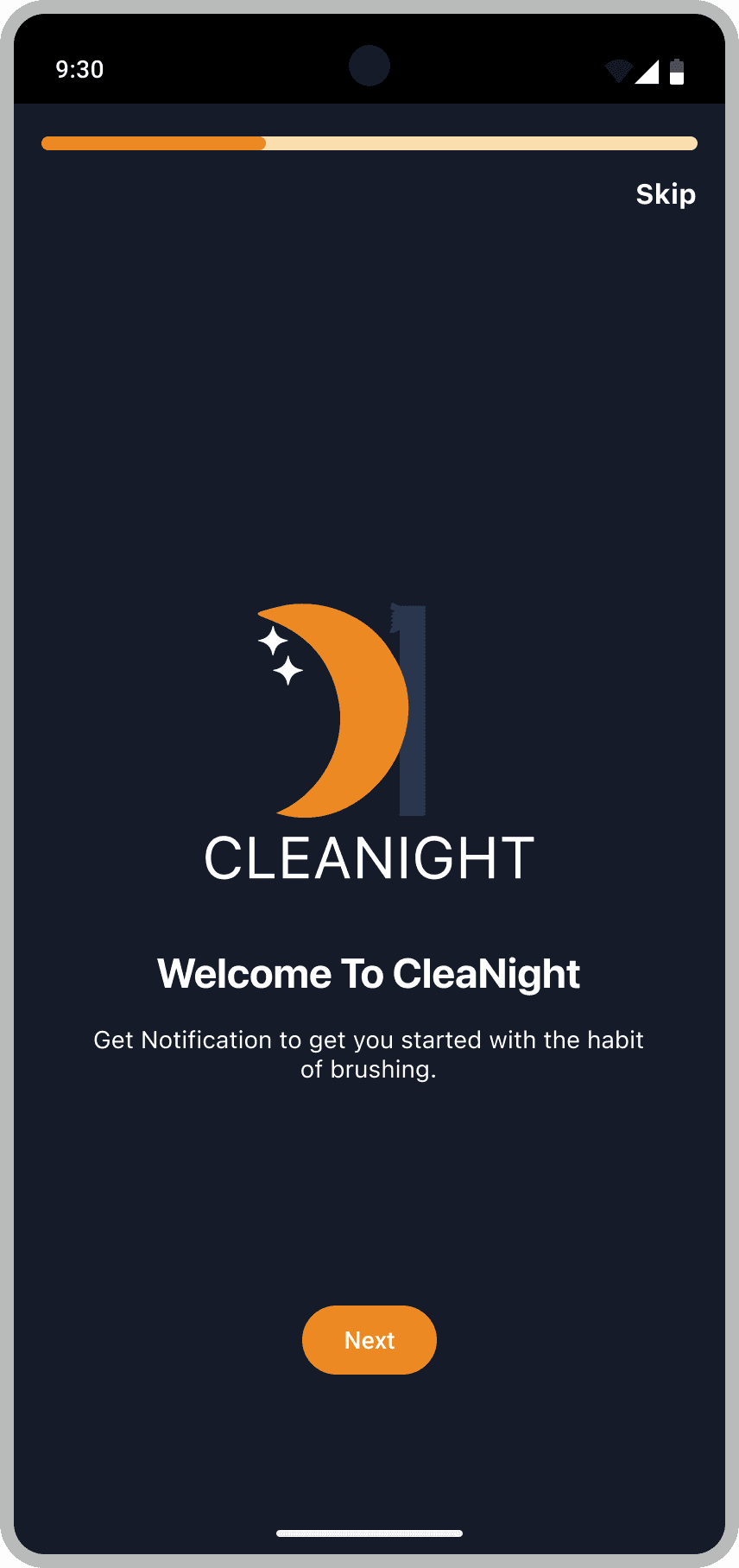
CleaNight


Progress
25%
CleaNight application was designed as a part of in-class Semester project that aimed to develop a habit-forming app based on brushing teeth before bed. The deliverable was to explore the concept of the hook model and design an application that engages users by providing them with what they are looking for.
My role
Timeline
4 months
Industry
Consumer health and wellness, Habit formation
Problem
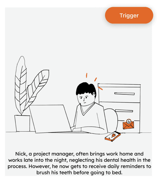
Teenagers and young adults aged 12–24 often go to bed without taking care of their oral health because they see it as overwork, feel lazy, or struggle to start and keep the habit consistent. Many get constant reminders or even scolded by their parents, which sometimes leads to giving up on the habit altogether or seeing brushing before bed as a big task rather than a necessity. There is a lack of a platform that can motivate teenagers to start, manage, and stick to brushing their teeth before bed making it feel less like a chore and more like a normal part of life.
Goals
To design a digital experience that encourages users to consistently brush their teeth before bed by making the habit engaging, easy to track, and rewarding ultimately improving the oral hygiene outcomes.
Solution
CleaNight is a habit-building mobile application designed to increase user engagement with nightly brushing routines. By Leveraging simple design tricks, helpful reminders, and rewards for good habits, the app transforms brushing into a rewarding and trackable experience motivating users to develop and sustain healthy habits over time.
Impact Expectation
89%
Boost in confidence among users using in the product
75%
Achieved successful task completion during testing showing the app's intuitiveness.
By transforming nightly brushing into an engaging and rewarding activity, CleaNight aims to increase user retention and consistency in oral care routines.
Process
I used 5 Elements of UX method to design my product facilitated by Hooked model concept. Soon after finishing my hi-fi prototype, I conducted usability testing to gather key insights on whether the product delivers the goal it should meet to the users.
Strategy
Scope
Kano cards, MOSCOW
Structure
Skeleton
Lo-fi Sketches, Hi-fi Wireframes
Surface
Hi-fi prototype
Iteration
User testing, Synthesis, hypothesis based iteration
Opportunity
Provide a platform that rewards users with interesting incentives that triggers users to make brushing their daily habit.
Storyboarding
Scoping
Key Features
I developed the feature list using Kano cards to classify satisfaction drivers and the MoSCoW method to prioritize Must, Should, Could, and Won’t‑have items. This prevented feature clutter, kept focus on real user problems, and guided which layers and embellishments were truly worth investing in balancing user delight with feasibility.
Structure
I structured content with clear hierarchies and task‑flows to reduce cognitive load. Navigation and labels were standardized for findability across breakpoints. User flows informed modular layouts that scale without feature clutter.
Wireframes
Solution
CleaNight
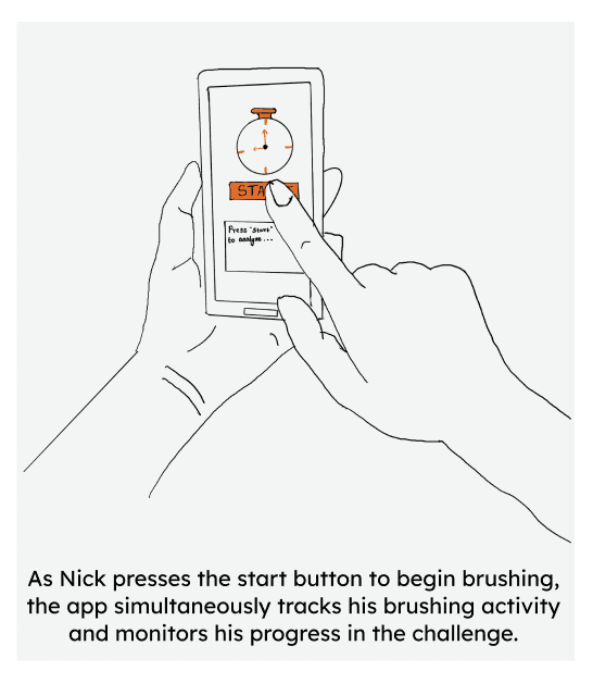
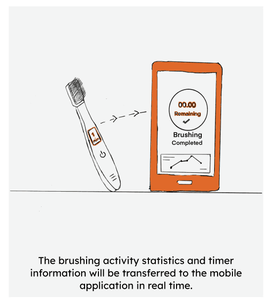
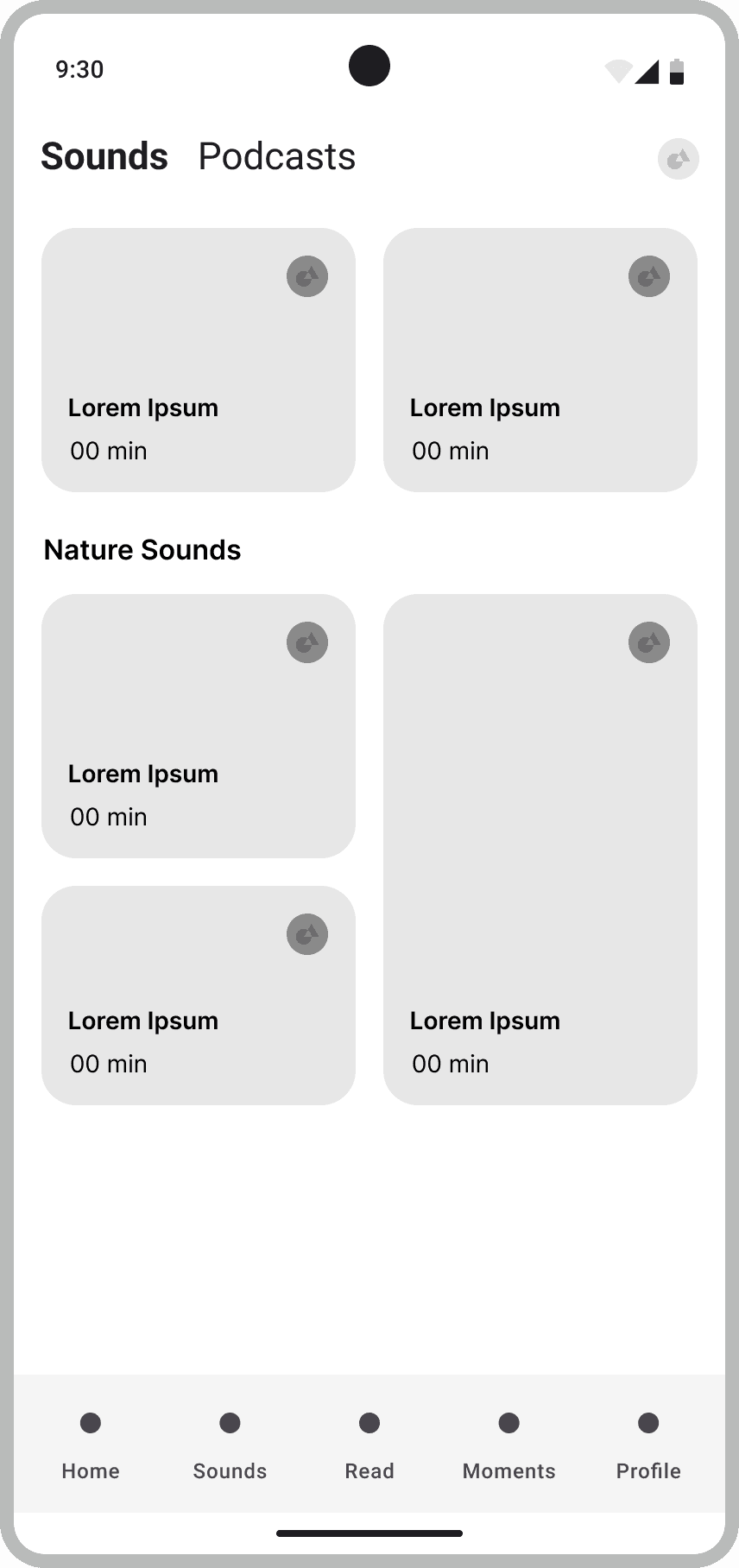
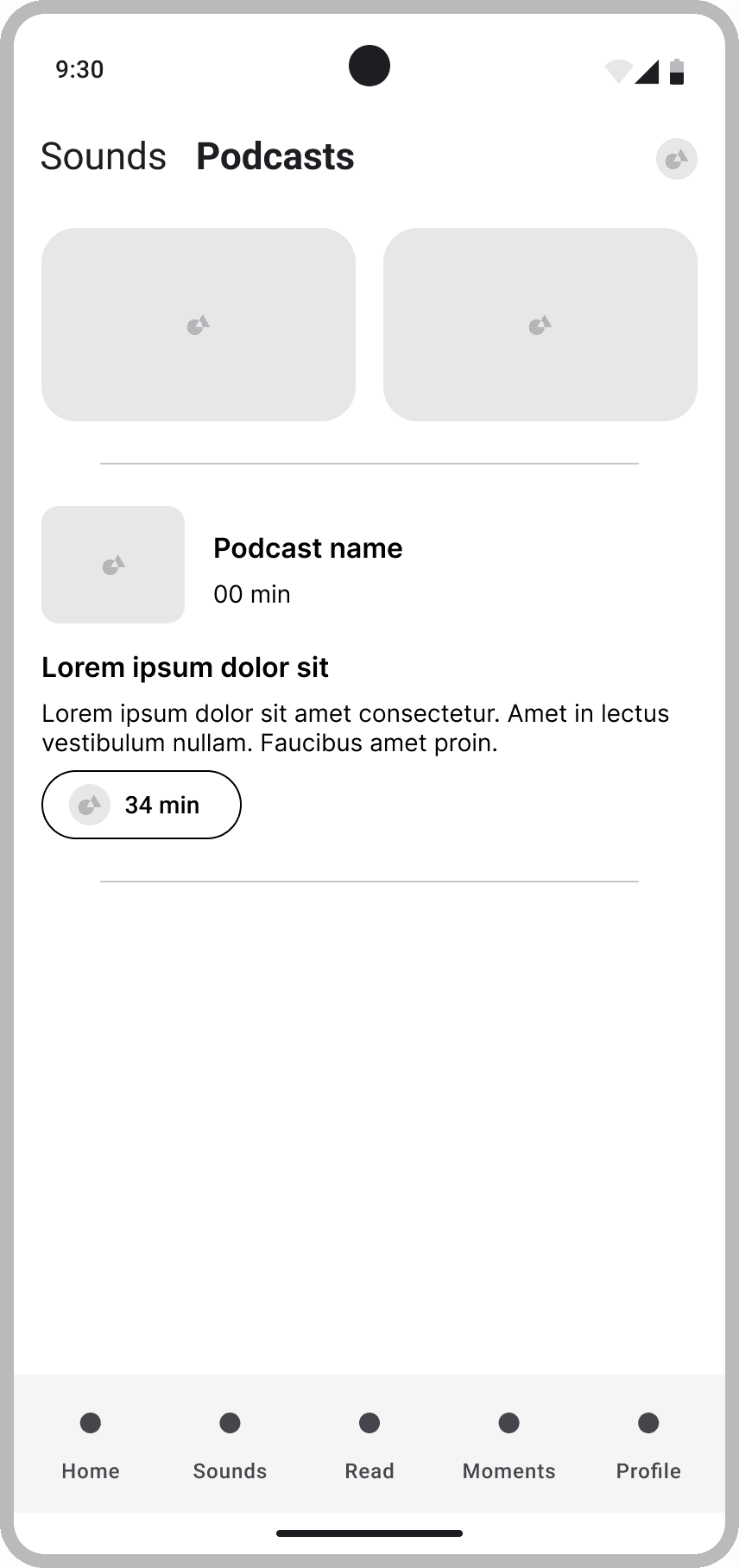
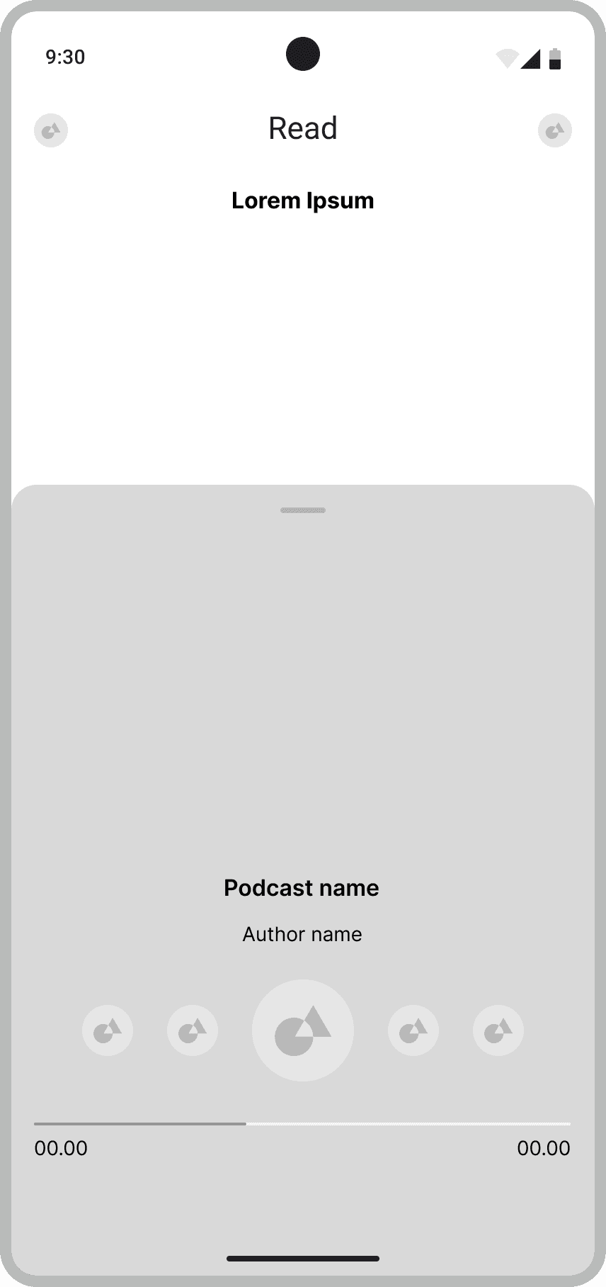
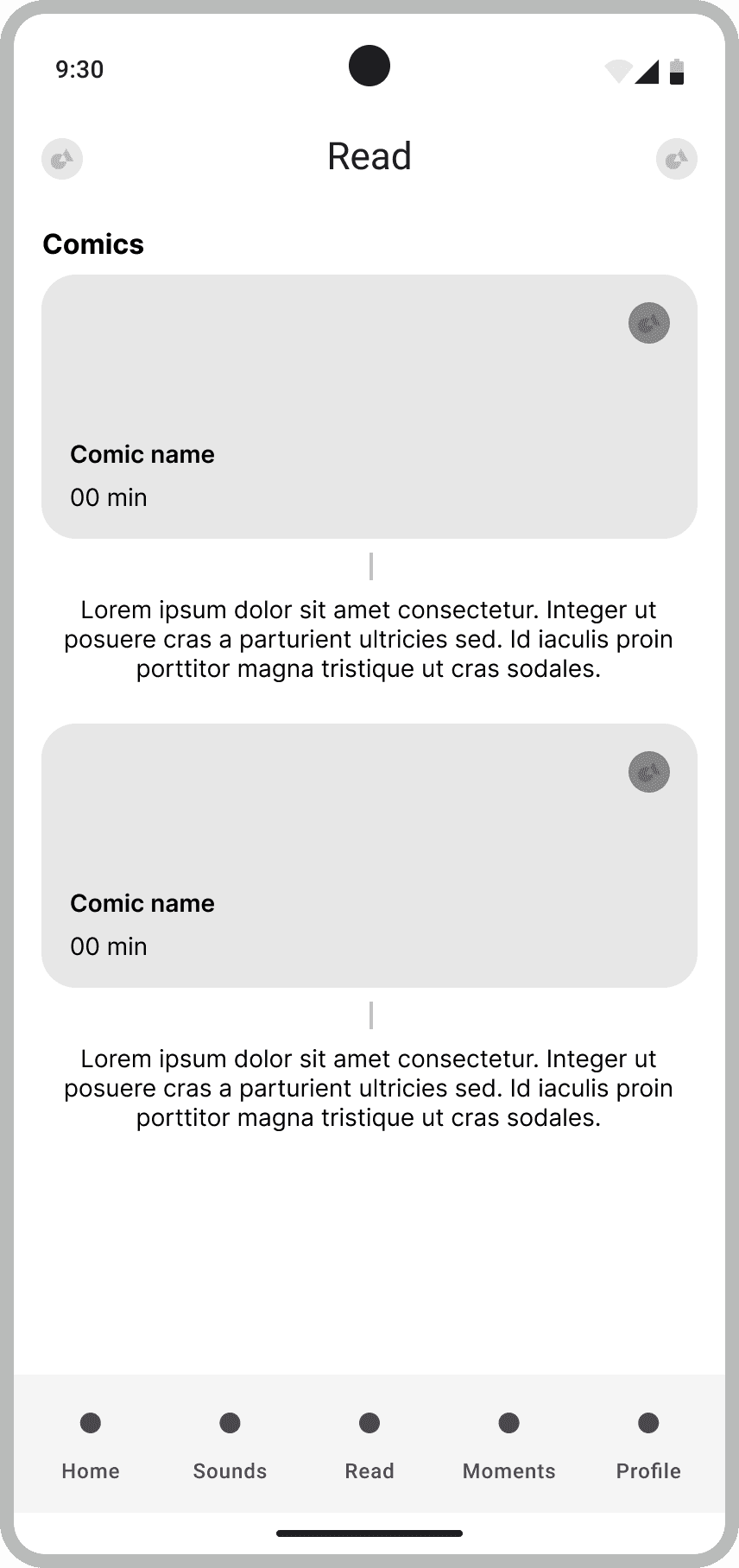
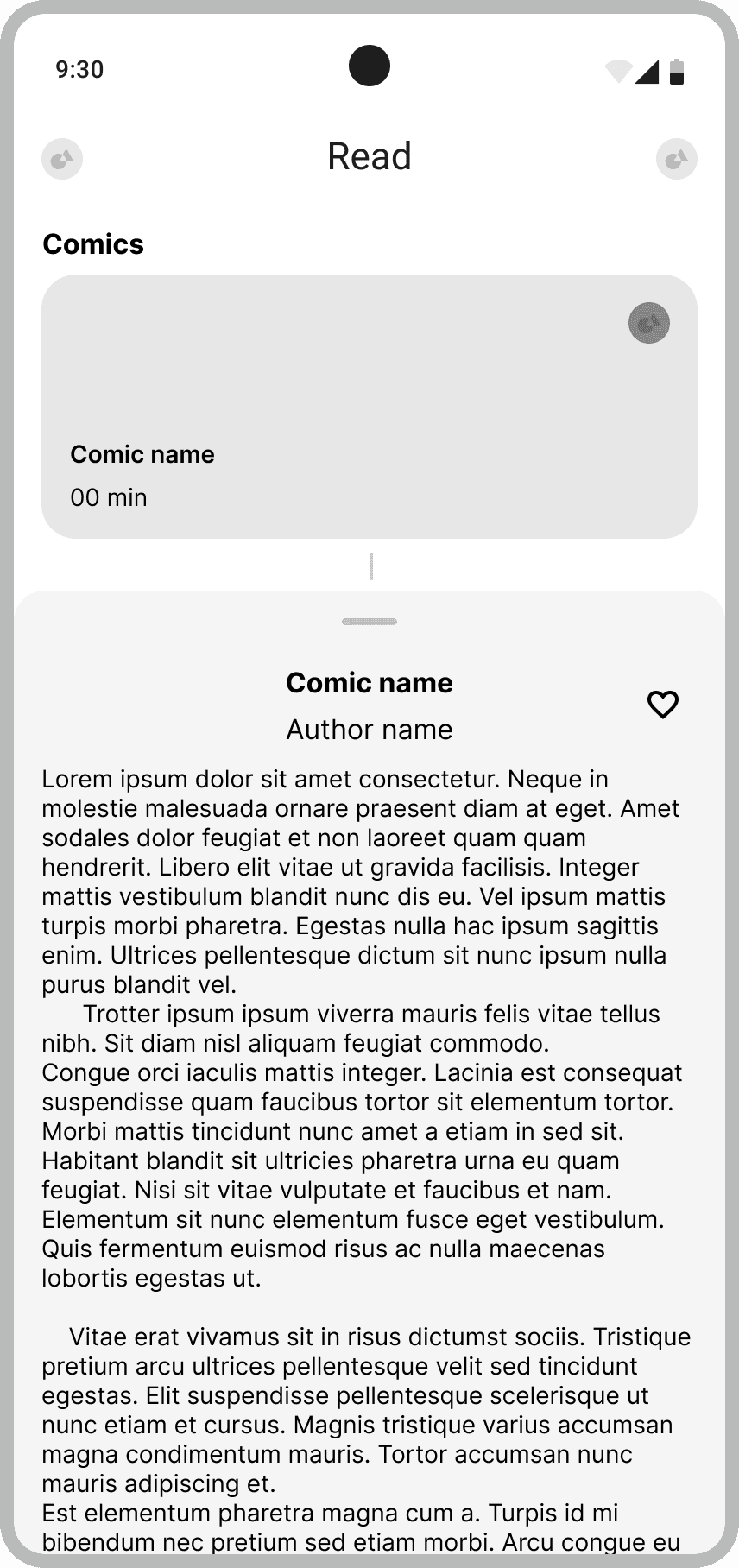
Start Brushing
Offer reminders and allow them to track progress through streaks and visual indicators. It motivates users to start as well as make them follow their habit daily by giving valuable rewards as incentive.
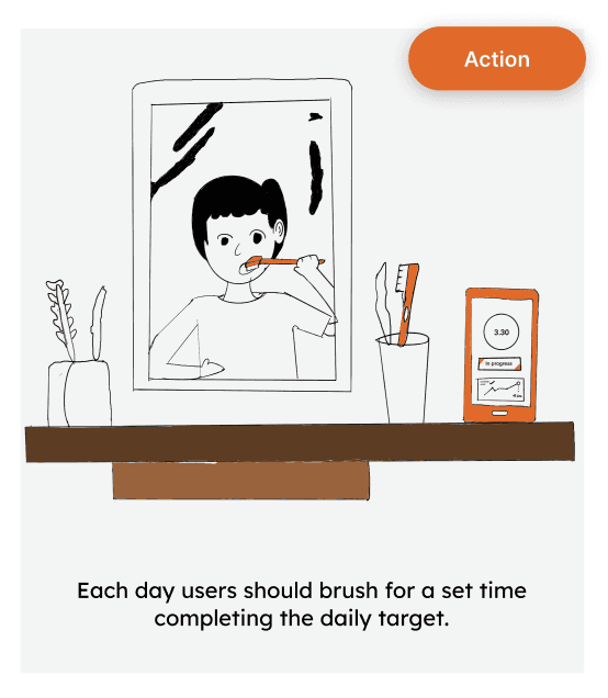
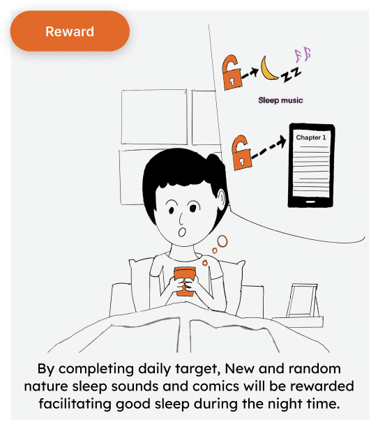
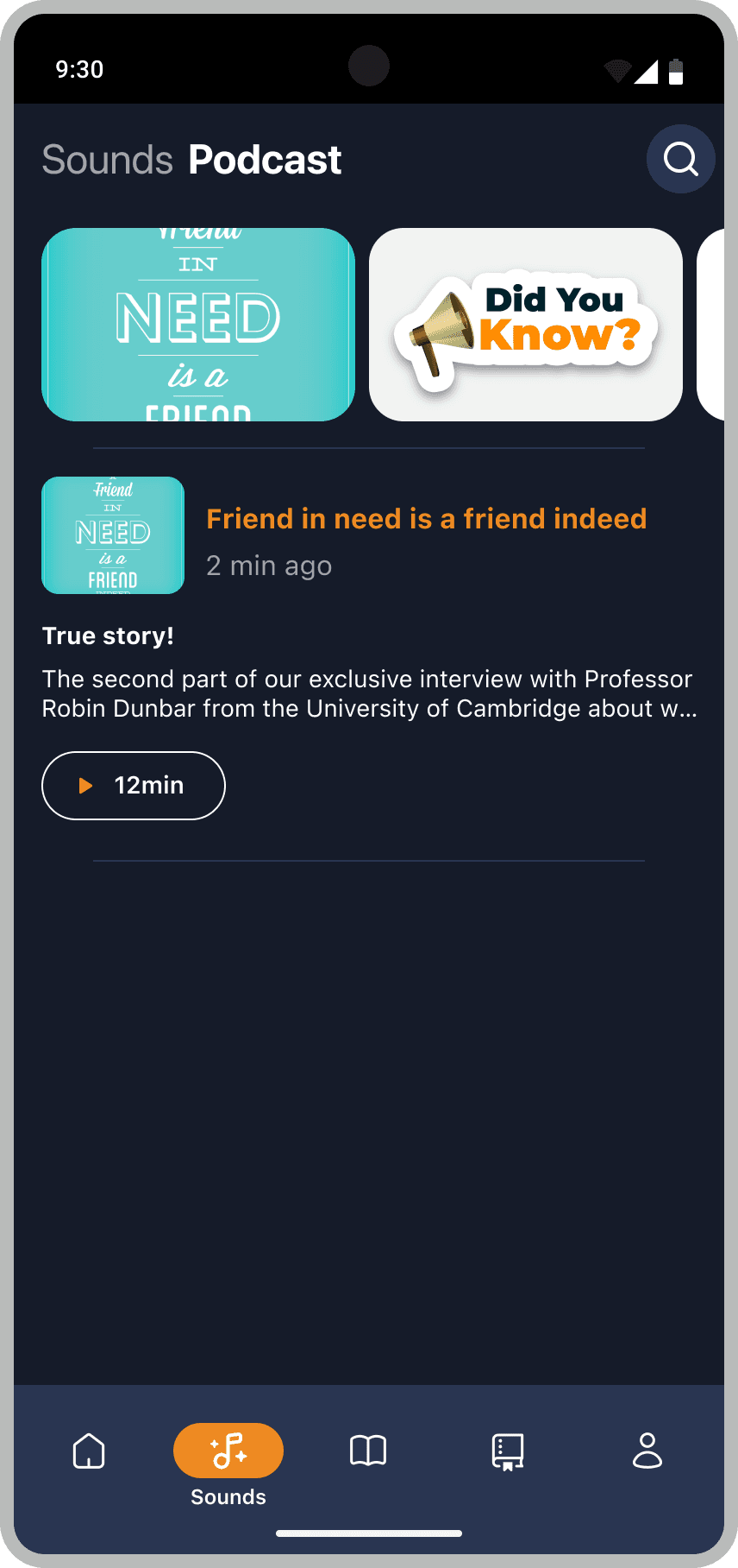
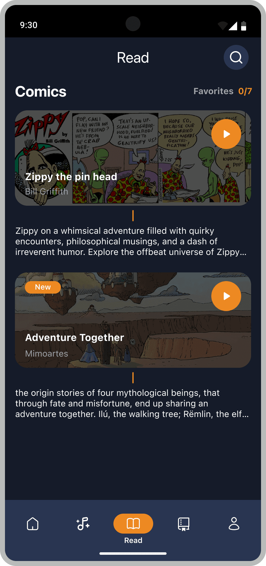
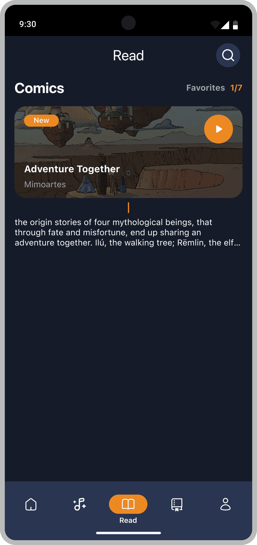
Encourages app users to return regularly, investing five minutes each day in maintaining their oral hygiene, by heightening their anticipation of receiving fresh and surprising rewards on a weekly basis.
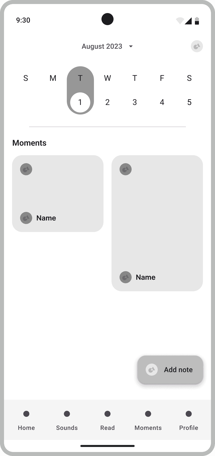
Homescreen
Rewards
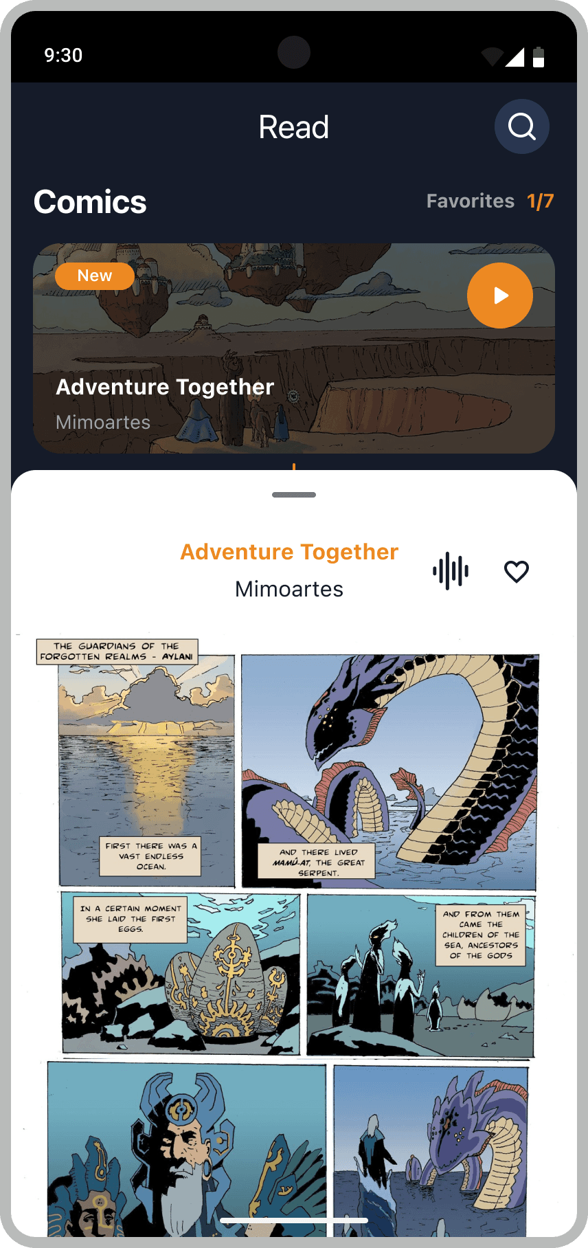
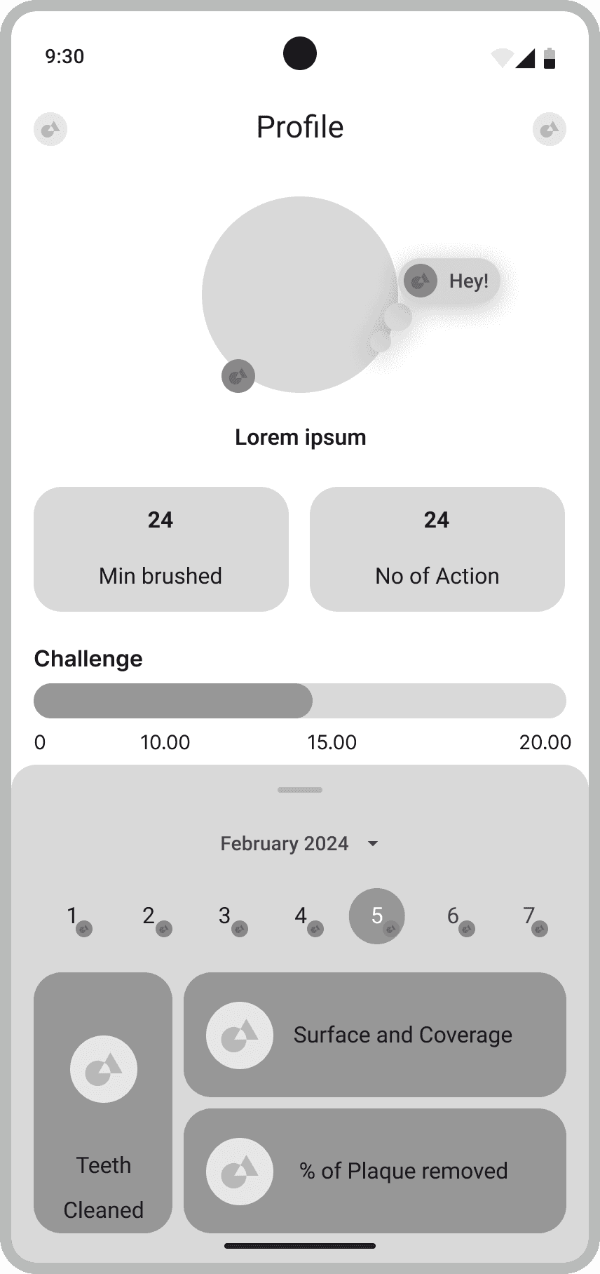
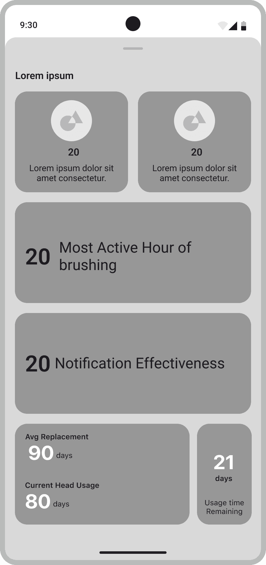
Profile/Statistics
User Testing
Participant feedback
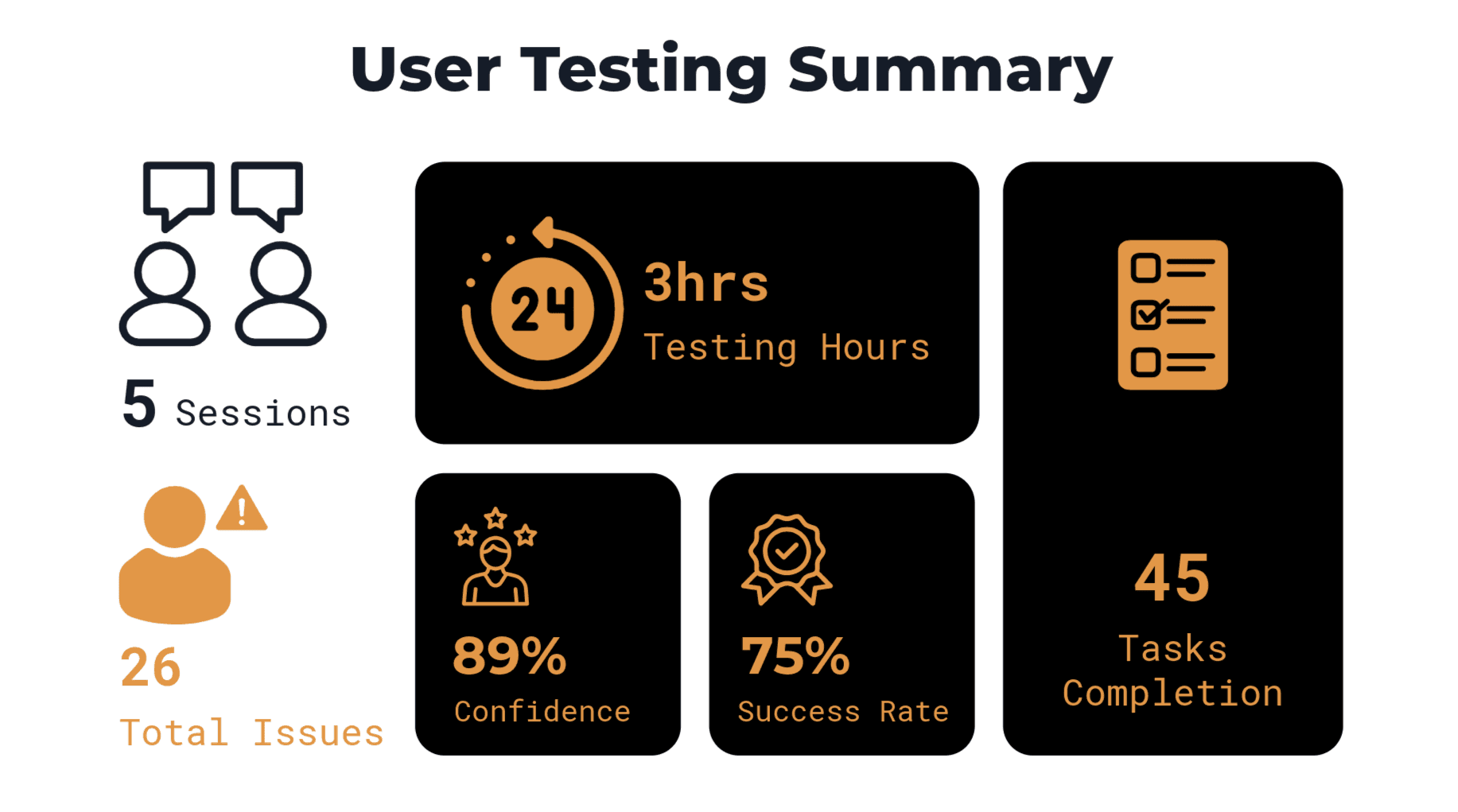
5 interviews, each approximately 30 minutes in duration, were conducted, recorded, and transcribed for in-depth analysis. Detailed debriefs were created for each interview to identify recurring patterns.
Key pain points for improvement
“Yeah, so I was trying to figure out how the future rewards were gonna be offered to me” - Jashwanth
Rewards expectation
“I wasn't sure where to look to see how I was doing on the app. I swiped around for a while but couldn't find anything.” - Sai surya
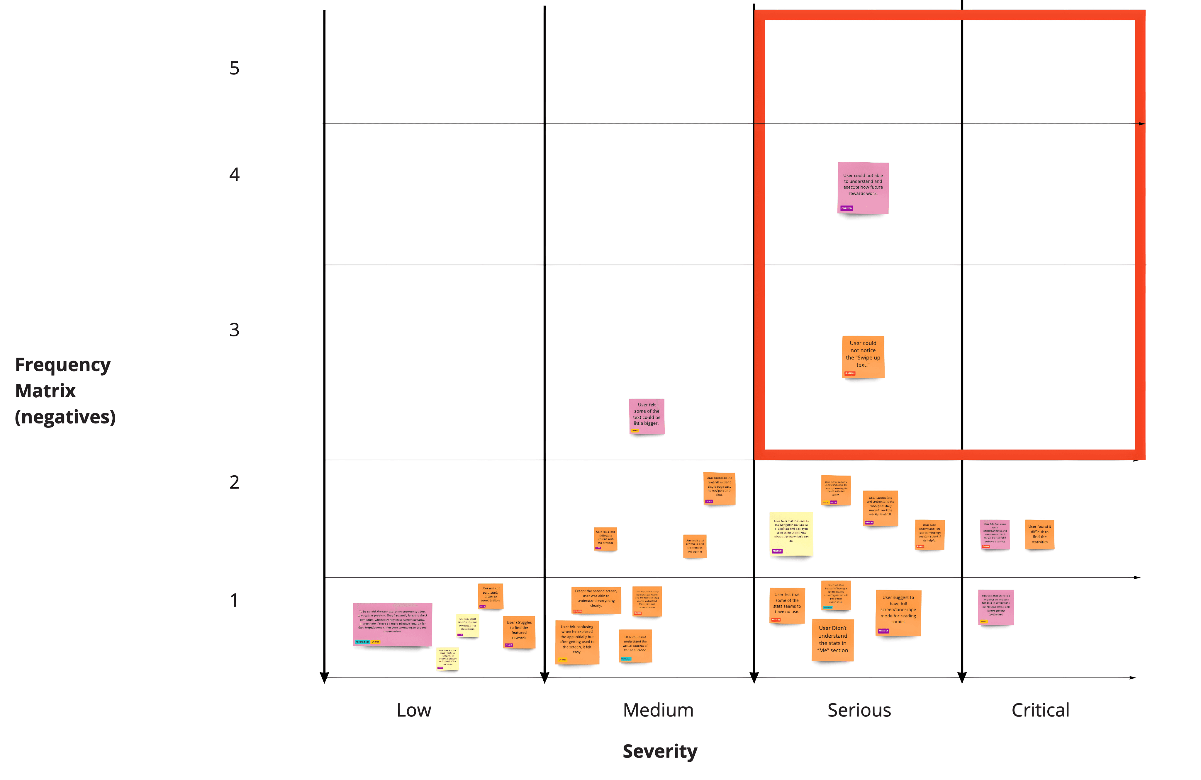
I gathered extensive feedback on both the UI and usability. To organise this information, I used a frequency matrix to identify and prioritize the key issues that users felt needed addressing.
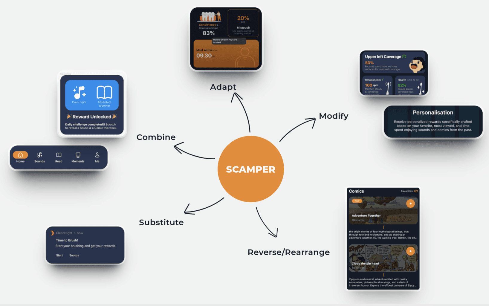
Apart from the key insights, I had to rectify necessary UI mistakes that disrupts the normal workflow of the app. but then to come up with suitable solutions, I approached SCAMPER i.e Substitute, Combine, Adjust, Modify, Put to use, Eliminate and Rearrange.
By following this approach, I had a clear idea on how to come up with simple solutions that will effectively help user’s have a good user experience of the app.
Takeaways