

My role
Project
Experimental project
Timeline
2 weeks
Overview
Problem
Many designers struggle to choose suitable colors for components, often relying on external references and switching between multiple tabs to find usable palettes. Most existing color-generation tools are limited or locked behind paywalls, slowing down workflows and making consistent, accessible palettes hard to create.
Solution
ApplytoUI, an open-source, context-aware color system generator that helps designers especially those who struggle with choosing colors, create accessible, predictable, and ready-to-use color ramps for real UI components.
Why this matters?
For designer like me..
Choosing colors becomes
Faster
More reliable
Less stressful
System-driven rather reference-driven
For design teams
Reduces inconsistencies
Eliminates last-minute accessibility fixes
Improves component behavior across states
Standardizes color usage early in design
No more switching tabs, checking inspiration boards, or paying for tools.
Generates colors mathematically
Ensures WCAG contrast compliance
Applies colors contextually
Works instantly within component previews
Helps designers who aren’t confident in
color theory
And costs nothing unlike other closed,
premium tools
Experimentation Attempt 1: RGB Shade Interpolation
I began with linear interpolation in RGB space but it failed quickly:
• Shades became too similar
Light and dark bases lost distinction
Hover & active states were unclear
Contrast often failed
Palettes looked visually uneven
Experimentation Attempt 2: HSL-Based Shade Generation
Input your brand/
base color
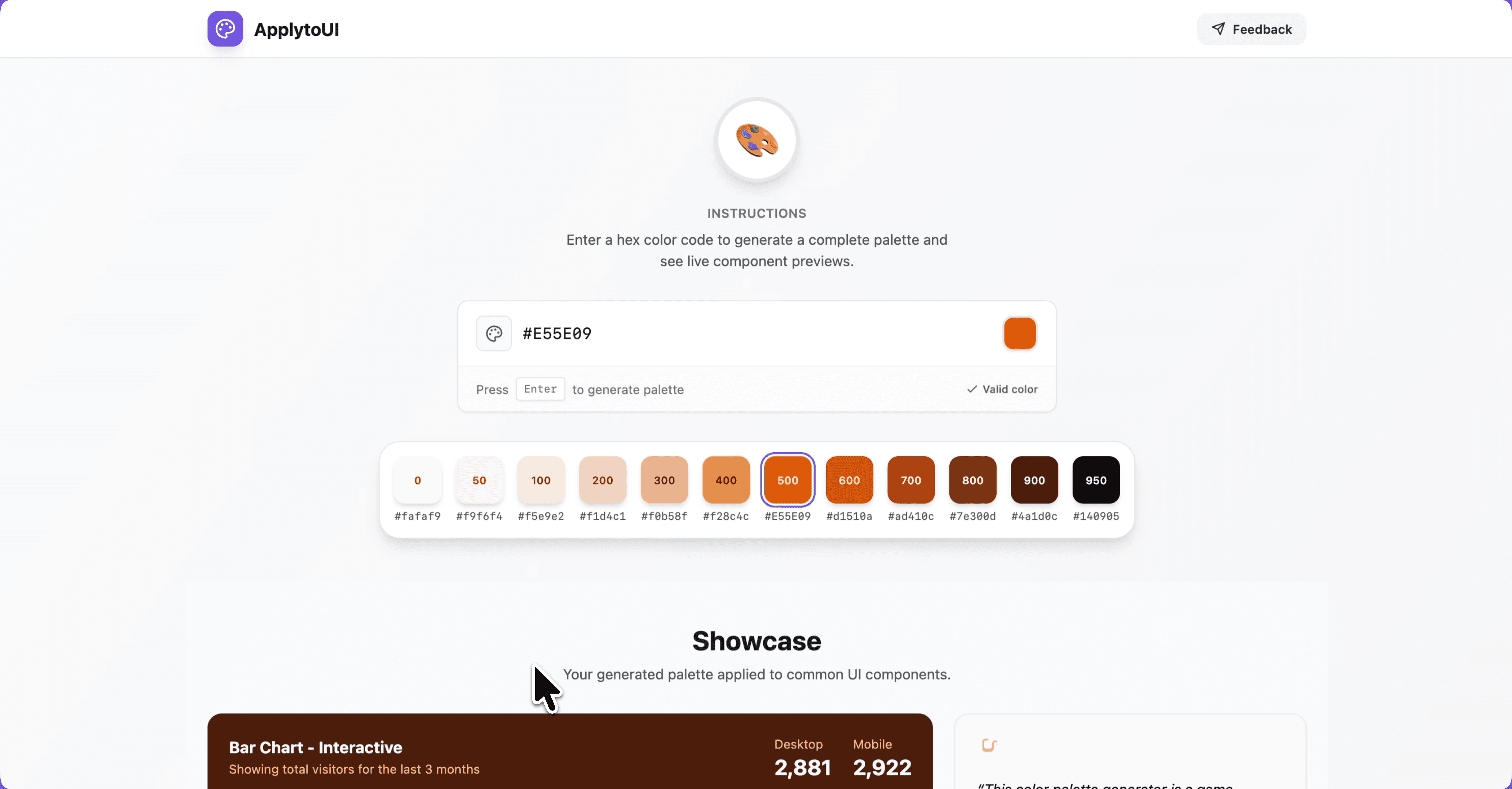
Enter brand color in Hex code
12 contextual shades
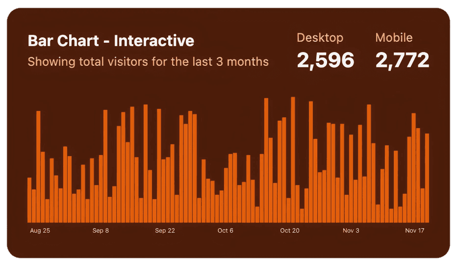
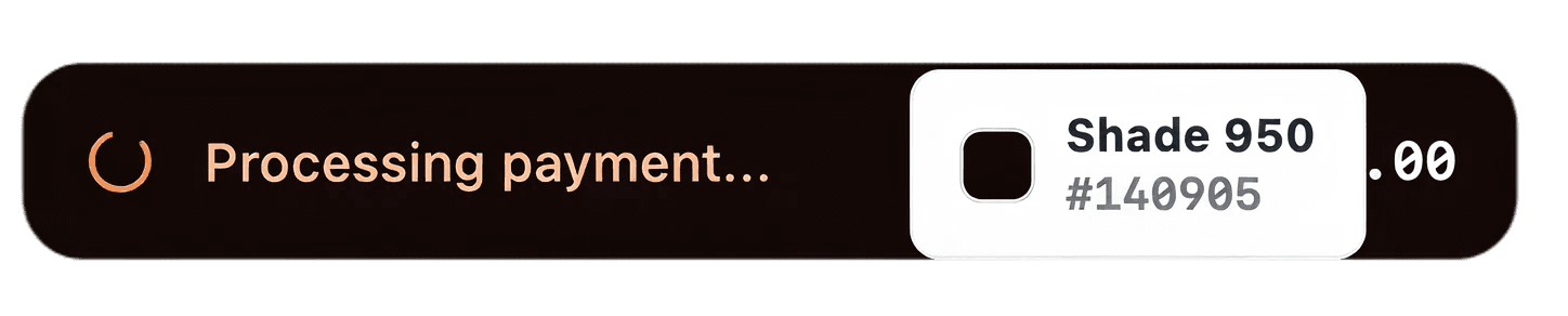
Reference the example components to apply generated colors by their assigned color roles in your designs.
Features
WCAG
3.0
Simple contrast
4.5:1
7:1
3:1
WCAG driven color implementation
Text, Surfaces, Borders, and States.
Revenue
Last 30 days
Default
Component-aware mapping
Buttons, Inputs, Cards, Alerts and Background surfaces
Hex code Preview
Hover over the colors to analyze color usage.
Micro-animations
Introduce subtle hover lift, state change effects that guides attention without distraction.
Reflection
What I learned?
This project started out of personal experimentation but became something needed and genuinely useful.
• Many design problems are solvable through algorithmic thinking.
Vibe-coding + design intuition can create surprisingly strong tools.
Accessibility and system-thinking should lead color decisions.
Designers struggle with color more than we admit—and better tools should exist.
Next Steps
What’s next for this tool
Figma token export
Multi-color palettes
Test and tweak component colors.
Open-source
Free to use
I’m open‑sourcing this tool so designers who struggle with color can use it freely—no limits.
Click the below link to access my github repository.
ApplyToUI repository